AP X SWATCH Royal Pop: Monochrome, Contrast and Wrist Presence
A bold, playful statement piece built for colour, summer energy and everyday wrist presence.
 Special Drop
AP x Swatch Royal Pop: Inside the Black & White Edition
PWC Journal — Watch Culture
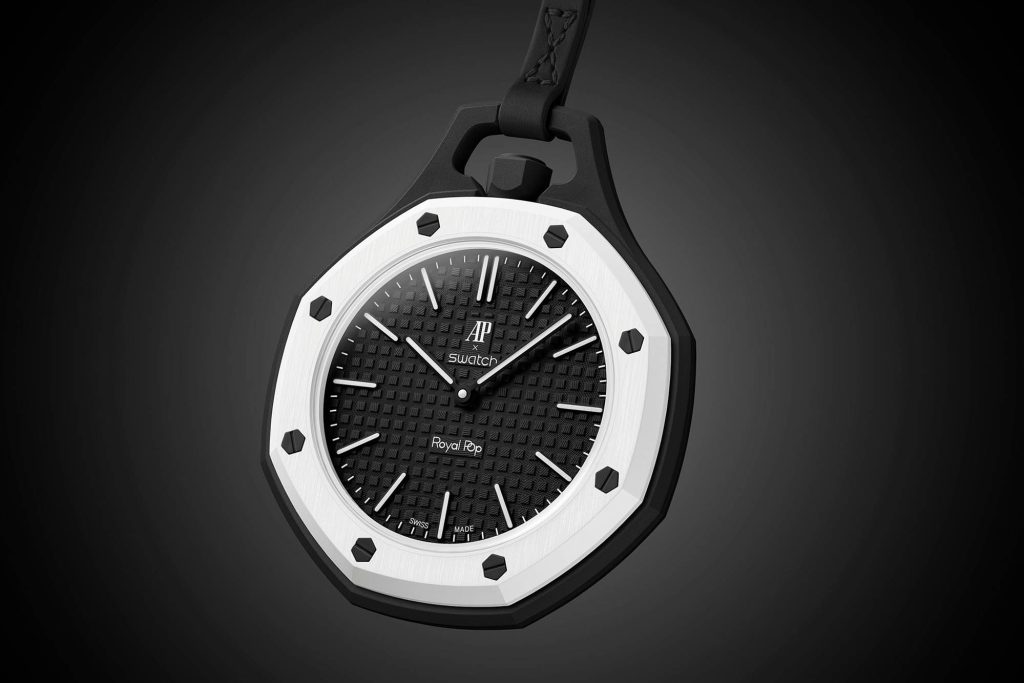
The black-and-white Royal Pop is built around one simple idea: contrast.
A bright white octagonal bezel sits against a dark case, dial and strap, immediately giving the watch a bold and graphic appearance. Rather than relying on bright colours or excessive detailing, this version lets its shape do most of the talking.
From a distance, it is clean and recognisable. Up close, the exposed screws, textured dial and angular case reveal far more character.
The result is a watch that feels playful, modern and surprisingly easy to wear.
Design Built Around the Bezel
The bezel is the defining feature of the Royal Pop.
Its white finish immediately stands out against the darker body of the watch, while the exposed black screws emphasise the octagonal shape even further.
That geometry gives the watch its strongest visual identity.
Rather than blending into the case, the bezel almost sits on top of it like a frame. This makes the entire watch feel more architectural and gives the front of the watch a much sharper appearance.
The contrast also means that every angle is easy to see.
On the wrist, this is what creates the Royal Pop’s presence.
It is not oversized colour or excessive decoration doing the work.
It is shape.
AP X SWATCH ROYAL POP
Special Drop
Competition ClosedThe Dial Keeps Things Clean
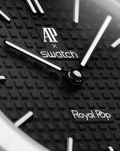
The dial follows the same monochrome direction as the rest of the watch.
A dark, textured surface provides the backdrop, while the lighter hands and hour markers create enough contrast to keep the watch easy to read.
That restraint is important.
The case already carries a lot of visual character, so the dial does not need to compete for attention.
Instead, it works as a cleaner centre point within the white bezel.
The result is balanced: enough detail to feel interesting, but not so much that the design becomes busy.
In this version, the dial helps the case remain the star of the watch.
The Octagonal Shape Is the Main Event
There is no hiding where much of the Royal Pop’s visual appeal comes from.
The octagonal case profile is instantly recognisable and gives the watch a strong, structured look from almost every angle.
The exposed screws add to that effect, making the front of the watch feel mechanical and graphic at the same time.
In black and white, that shape becomes even more obvious.
The white bezel outlines the octagon clearly, while the darker case underneath creates depth.
This gives the watch a layered appearance that works especially well from the side and three-quarter angles.
It is one of those designs that looks different depending on how the light hits it.
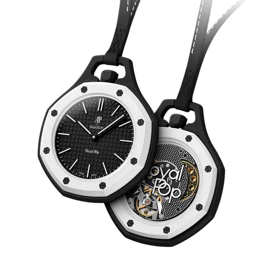
Front and Back Tell Two Different Stories
From the front, the Royal Pop feels controlled and relatively clean.
The black dial, white bezel and dark strap create a simple monochrome composition.
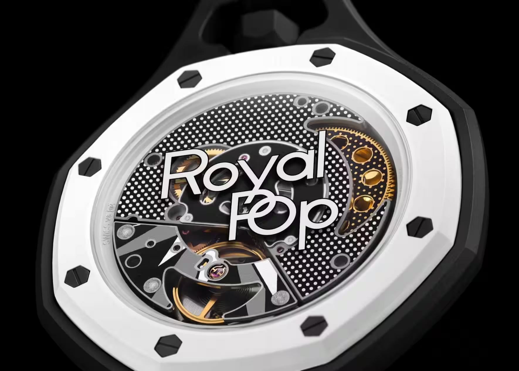
Turn the watch around and the personality changes.
The rear design is much more expressive, with additional detailing and graphics that make the watch feel more playful.
That contrast between front and back gives the piece more character than you might expect from a black-and-white watch.
The front is the part you wear.
The back is the part you discover.
And together, they make the Royal Pop feel less one-dimensional.
Why the Black & White Version Works
The strength of this version is its wearability.
Brighter Royal Pop colourways naturally attract more attention, but black and white gives the design a cleaner and more versatile edge.
The watch still stands out because of its case shape and bezel, but the colour palette makes it easier to combine with everyday clothing.
Black, white, grey, denim or neutral tones all work naturally around it.
That makes this one of the easier Royal Pop versions to actually wear regularly.
It still has the fun and unusual personality of the design, just without needing loud colour to make an impact.
The black-and-white Royal Pop proves that a statement watch does not always need to shout.
Sometimes contrast is enough.
PWC Journal
Sharp geometry, strong contrast and unmistakable wrist presence — this Royal Pop lets the design do the talking.
admin · PWC Journal
Competition ClosedAP X SWATCH ROYAL POP · Special Drop